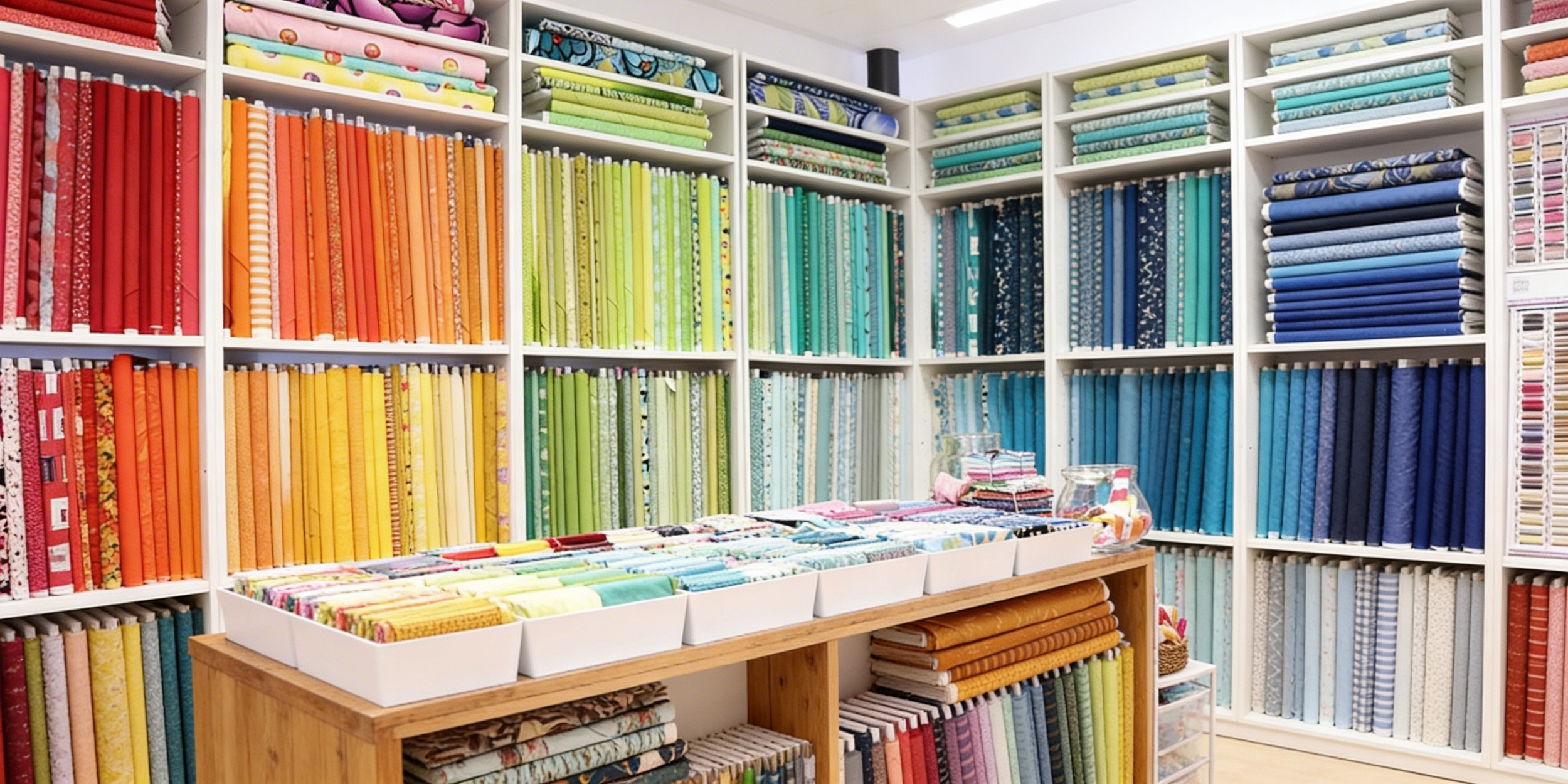
Okay, let's be real for a second. Have you ever found yourself standing in front of a wall of fabric bolts, heart racing, palms sweating, completely paralyzed by the sheer number of gorgeous options staring back at you? 🙈
Me too, friend. Me too. I once spent 45 minutes rearranging fabric on my table… only to end up right back where I started. There I was, coffee getting cold, muttering things like “maybe this blue?” and “why does this suddenly look wrong?” while slowly building a fabric mountain worthy of the Alps. Dramatic? Perhaps. Accurate? Absolutely.
Choosing fabrics can feel like speed dating in a room full of supermodels. Everyone is gorgeous. Everyone is tempting. And suddenly you trust no one. So I made myself a rule. One hero. No overthinking. And today I’m sharing the slimmed-down, sanity-saving version of my fabric selection framework — the one you can use in real life without blocking off an entire weekend (or needing emotional support chocolate). Let’s make this simple, shall we?
Step 1: Choose ONE Hero Print
Not five.
Not “just one more for safety.”
One.
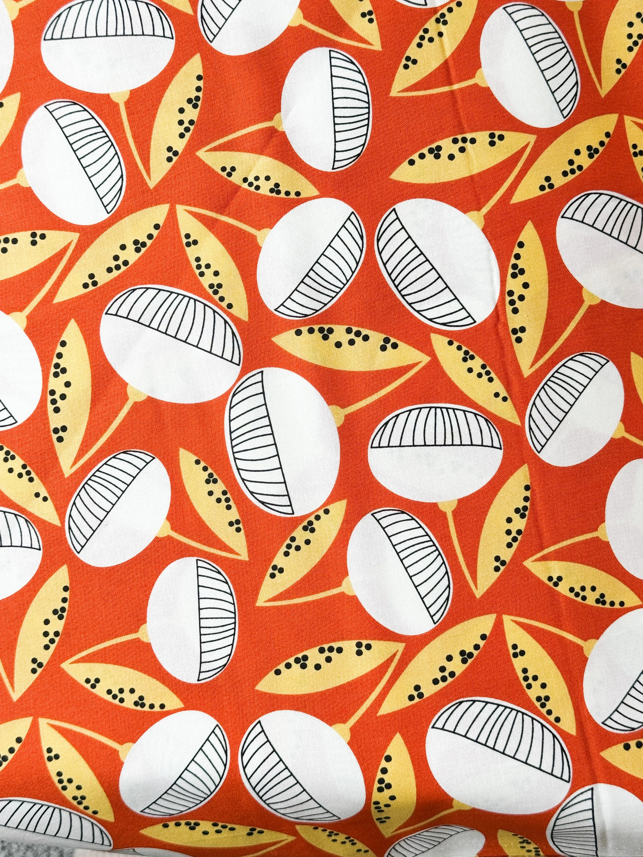
Your Hero Print is the fabric that makes your heart skip a beat. It’s the one that sets the mood — bold and graphic? Soft and poetic? Fresh and playful?
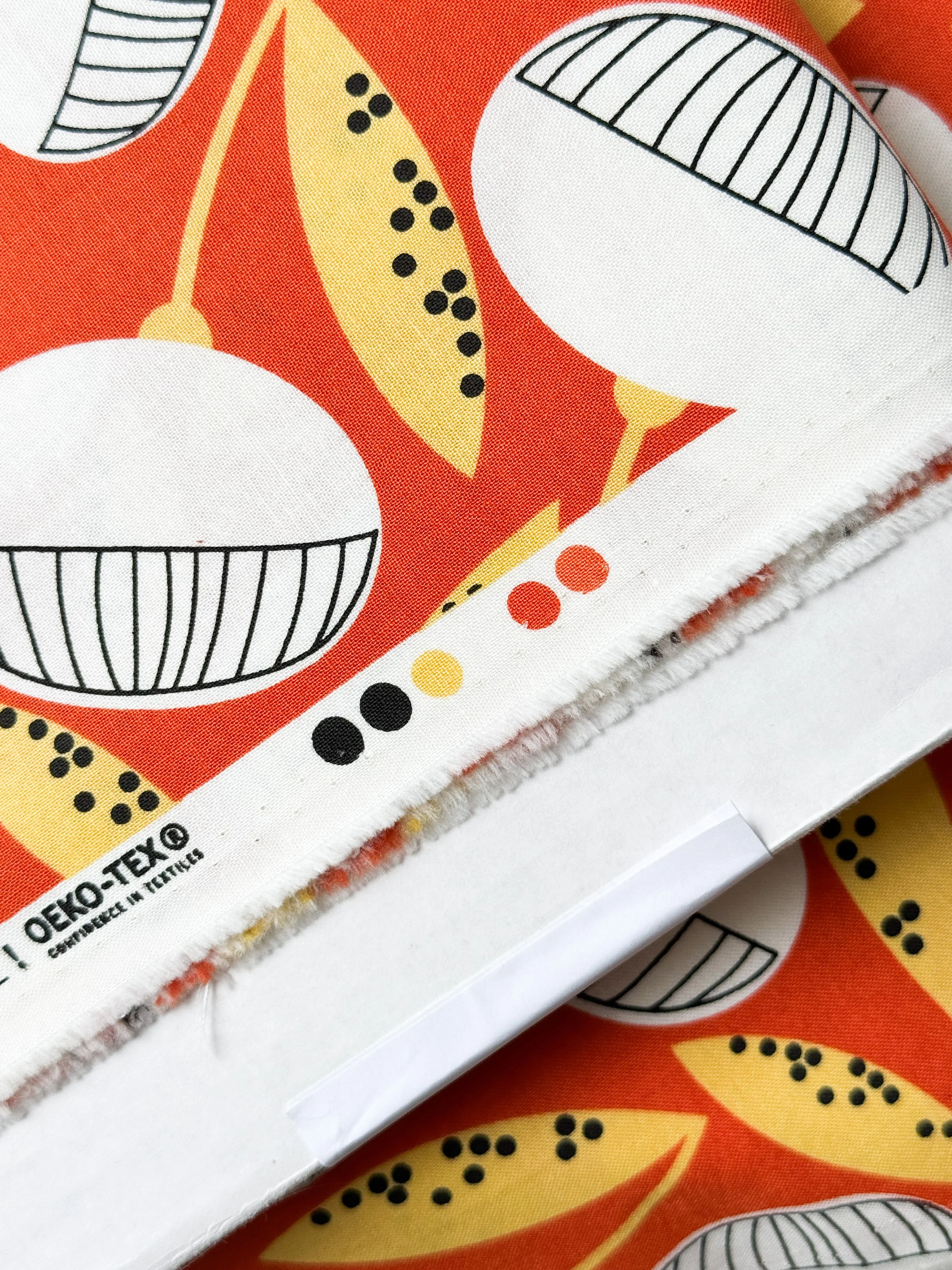
Here’s the best part: The selvage already did half the work for you. Those little color dots on the edge? That’s your cheat sheet. Your fabric designer (hello 👋) already curated a harmonious palette. You don’t have to reinvent it. Look at the dots. Pick 3–4 colors from there. Done. No spiraling. No second-guessing. No dramatic sighing.
✨ Lesson: Start with clarity. When you choose one anchor, everything else becomes supporting cast instead of competition.
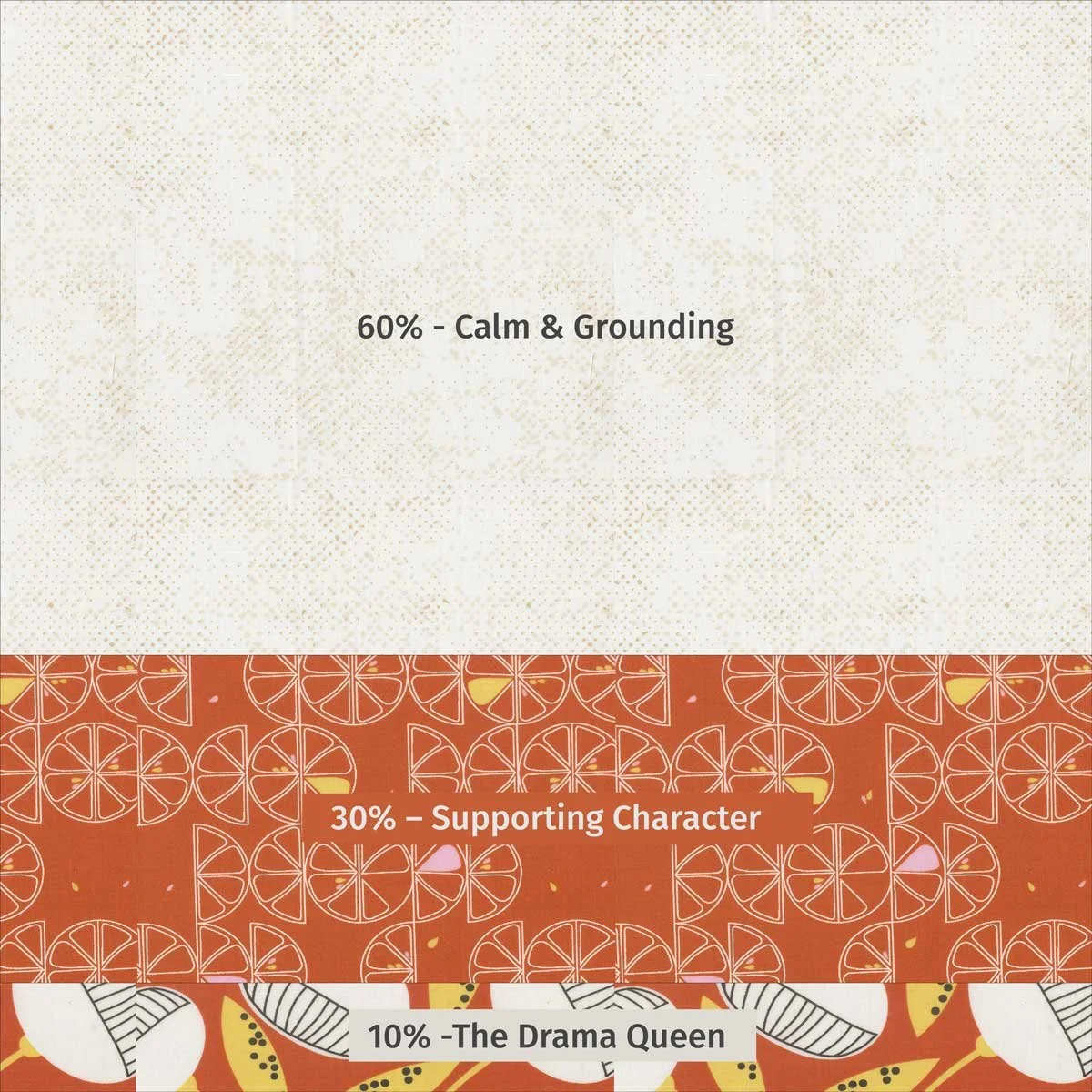
Step 2: Apply the 60–30–10 Rule (Yes, It’s That Good)
Now that your Hero Print is crowned queen, we give the court some structure. The 60–30–10 rule comes from interior design, and it works like magic for quilts.
60% – Calm & Grounding
Usually a solid or subtle blender. This is your background, your breathing room.
30% – Supporting Character
A secondary print or texture that adds interest but doesn’t shout.
10% – The Drama Queen 💋
The pop. The spark. The “Ohhhh!” moment.
Think of it like dressing for a chic dinner party. If everything is sequins, we need sunglasses. If everything is beige… we fall asleep in the soup.
Balance, my friends. Always balance.
So here’s what this might look like in real life:
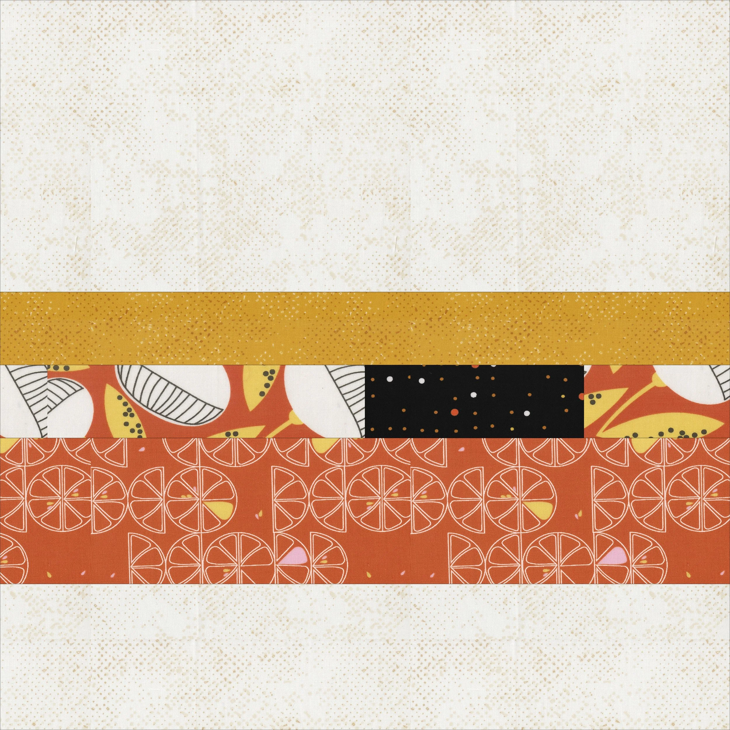
Your Hero Print includes orange, soft yellow, off-white, and a punch of charcoal.
60% → Off-white or soft yellow solid or blender
30% → A subtle orange geometric
10% → Your hero or that black pop
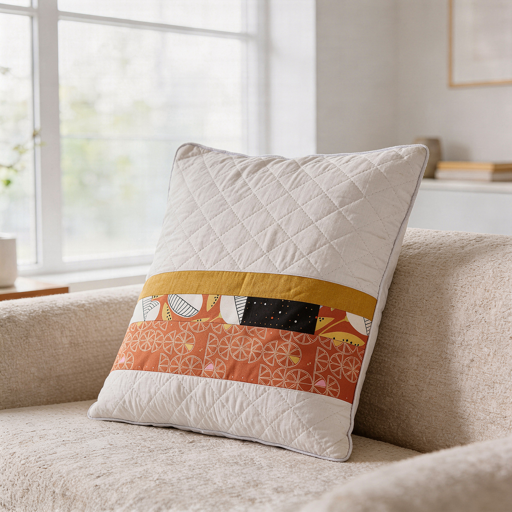
Lay them next to each other. Instant cohesion.
✨ Lesson: When you control proportion, you control harmony.
Step 3: Trust the Big Picture
Now before you start questioning everything again (because we do that), take a step back.
Literally.
Lay your three or four fabrics together. Stand up. Look from a distance. Better yet — squint a little. When you squint, the tiny details disappear and you see what really matters:
Is there contrast between light, medium, and dark?
Does one fabric pop?
Does it feel calm, balanced, intentional?
If yes? You’re golden.
If no? Adjust proportions — not the entire palette. Notice we are not redesigning the world here. We are tweaking. In my example, I chose the three fabrics according to the 60-30-10 rule, but added a touch of black to the 10% drama portion to bring in the very dark. I also distributed the 30% of supporting fabrics between a yellow and an orange coordinate.
✨ Lesson: Big-picture thinking prevents tiny-detail panic.
The Shortcut That Saves Hours ⏳
In less than 20 minutes, you can see the story come to life. No cutting required. No seam ripping therapy needed.
✨ Practical Value:
You can test a full fabric concept in under an hour using:
One Hero Print
Three supporting fabrics
The 60–30–10 rule
A quick snapshot of your layout of fabrics
That’s it. Confident. Cohesive. Efficient.
The Mindset Shift (This Is Important)
Fabric selection isn’t some mystical talent you either have or don’t. It’s structure + proportion + perspective. Once you stop trying to make every fabric the star, everything becomes easier. Cleaner. More modern. More Zen Chic.
And yes — once you understand the rules, you can absolutely break them. But break them on purpose. Not in a caffeine-fueled panic.
Your Turn 💛
Next time you’re standing in front of your stash (or a wall of bolts), try this:
Pick one Hero Print.
Use the selvage dots as your palette guide.
Apply 60–30–10.
Step back and squint.
That’s your framework. Simple doesn’t mean basic. Simple means powerful.
If you try the Hero Print Method, I would love to see your fabric pulls. Share them and tag me — cheering you on is one of my favorite hobbies.
Happy rule-breaking, quilt friends!
– Brigitte x