From Spotted to Whisp: Same Quiet Magic, Fresh New Chapter
There's a fabric in almost every quilt I make that doesn't get much credit.
It's not the one people point to first. It's not the showstopper. But take it out — and suddenly the whole thing feels slightly… off. Like a sentence missing its punctuation. (Yes, I went there.)
That fabric is what I call a coordinate. And for years, the one I kept reaching for was Spotted.
A Little Backstory (Bear With Me — It's Worth It)
Spotted was a blender line I designed for Moda. The idea was simple: a fabric that reads almost like a solid, but with just enough texture to keep it interesting. No style cues. No trend signals. Nothing that screams "this belongs to a specific decade or aesthetic." Just a quietly confident texture that works with everything — florals, abstracts, batiks, traditional, modern. Whatever you're making.
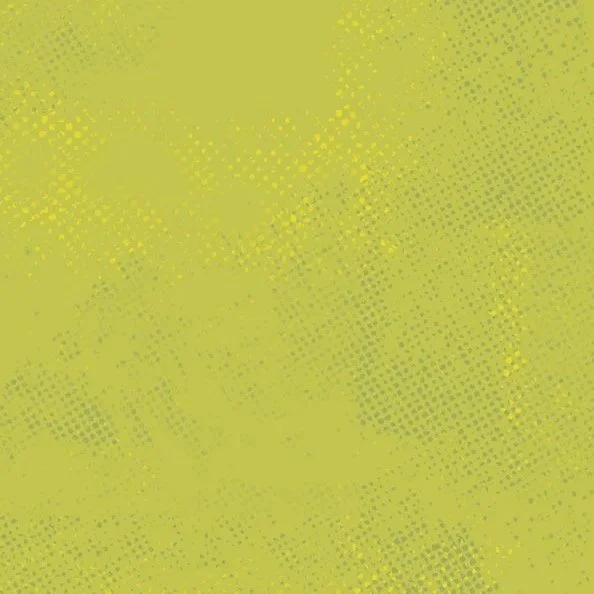
WHISP Texture Close Up
The texture, by the way, is rooted in a printing technique called risograph — a method known for its grainy, layered, slightly imperfect quality. You don't need to know what that is. You just need to know it gives the fabric a warmth that photocopied solids simply don't have.
What happened next surprised even me: with every new Moda collection I designed, we added new colorways to the Spotted library. One season at a time. Until, at some point, we looked up — and there were 260 colors.
Shop owners had built entire libraries of Spotted. Their go-to basics. The fabric they always had in stock because their customers always needed it.
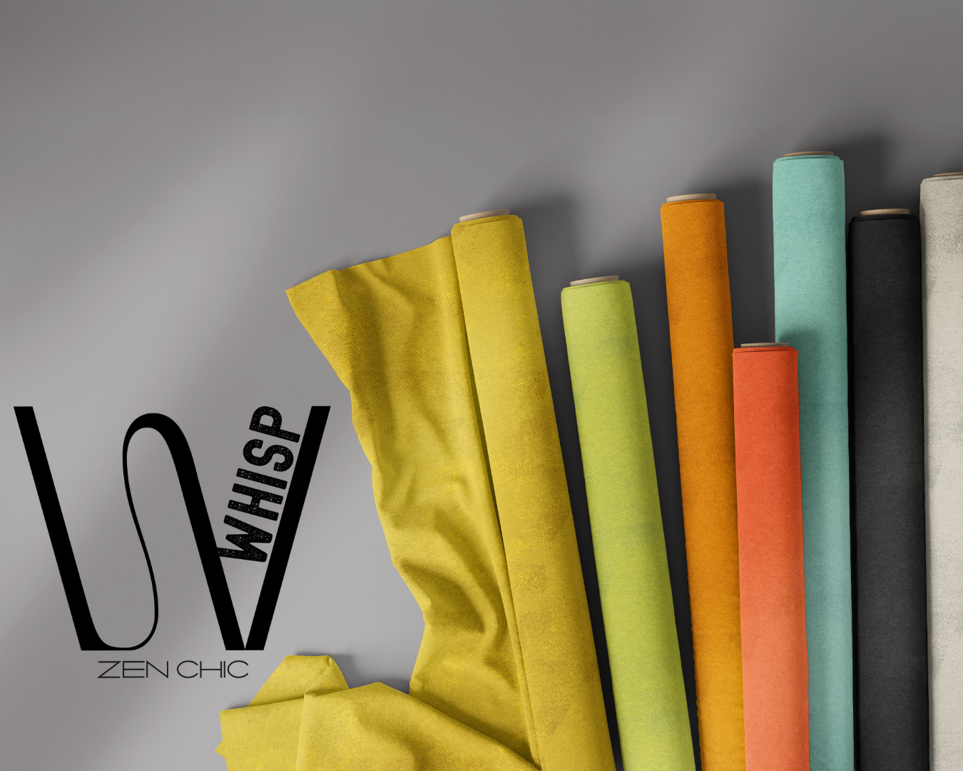
Enter Whisp
When I made the move to FreeSpirit Fabrics, I thought a lot about those shop owners.
They had invested in a library. And I wanted to give them something that let them continue that story — not start over.
So I designed Whisp. Same philosophy: subtle texture, timeless character, zero style agenda. Different enough to stand on its own as a new fabric for a new publisher. Similar enough that on a shelf, next to Spotted, you'd only notice the difference on second glance.
Same soul. New name.
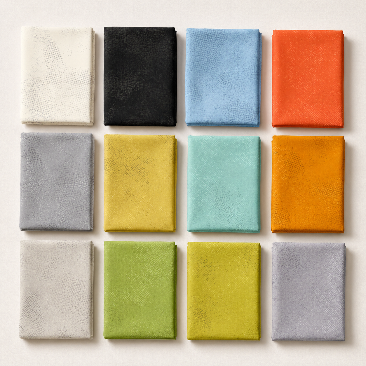
FreeSpirit and I are starting with twelve colorways. And those twelve? They were anything but random.
Twelve Colors, Two Jobs
Six of the Whisp colors were carefully calibrated to work with Ampersand — my debut FreeSpirit collection. Black, white, charcoal, that warm tomato red, a grounded green, and mustard. High contrast. Graphic. A little bit bold and unapologetic. Exactly what Ampersand needed.
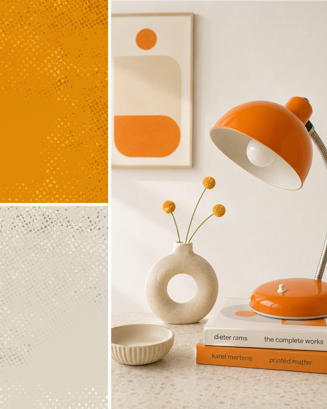
The other six extend the palette into quieter territory: a soft blue, a cool mint, a second green, a warm orange, a second neutral gray, and Limestone — a beautiful, creamy tone that goes with absolutely everything and asks for nothing in return.
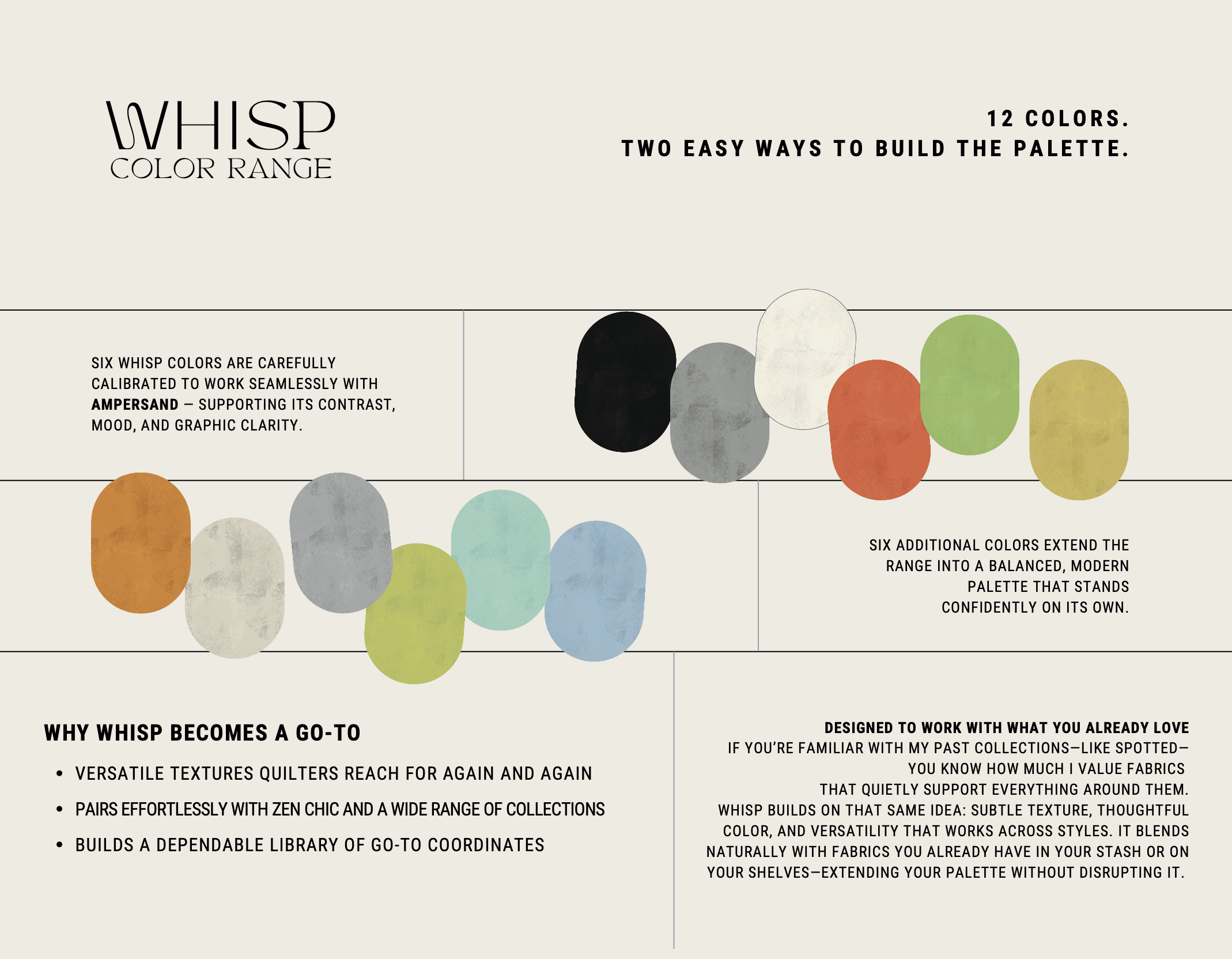
Put all twelve together, and you'll notice something: no pink. No purple. No violet.
That was intentional.
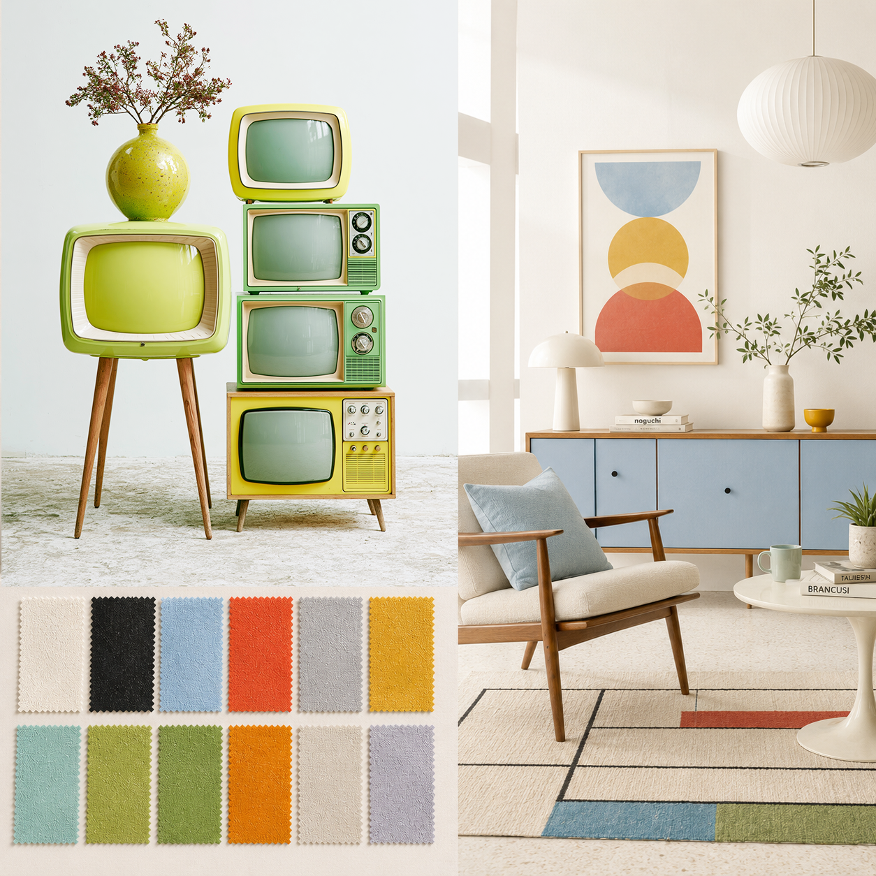
I wanted these twelve colors to carry a Mid Century Modern mood — warm, graphic, a little retro without being costumey. The kind of palette you'd find on a vintage poster or a well-designed 1960s kitchen. It ties back to that risograph origin in a way that feels cohesive rather than coincidental.
My Favorite (Since You Asked)
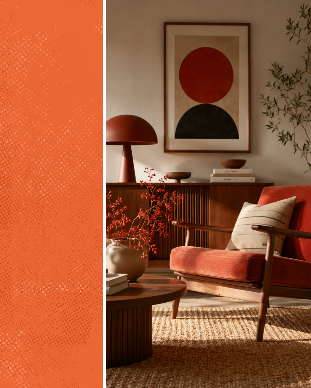
Honestly? The tomato red.
It's warm. It's saturated. It doesn't apologize for being exactly what it is. In a sea of carefully curated neutrals, that red walks into the room like it owns it.
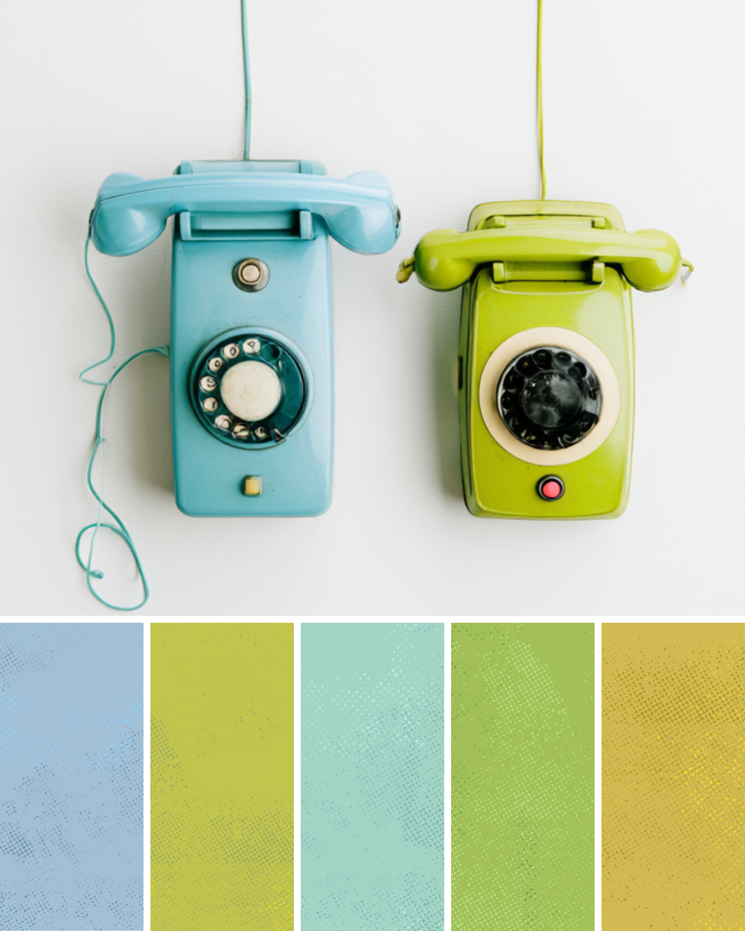
That said — the blue and mint tones? Quietly dangerous. Get them next to the right green or that soft gray, and suddenly you have a palette that tells a completely different story. Cooler, calmer, a little more coastal. Same fabric. Different mood entirely.
Which brings me to something I've been thinking about for a while.
Color Stories (A Sneak Peek at Something Coming)
One of the things I love most about a good coordinate fabric is how a single colorway change can shift the entire feeling of a project. Same blocks. Same pattern. Swap one color — and you've made a completely different quilt.
I want to start showing that more intentionally. Think of it as color inspiration, served regularly: a combination, a mood, an image that captures the feeling I'm after.
Consider this post the very quiet beginning of that idea.
More on that soon.
What's Coming Next Week
Next week, we're going deep into Petal Pop 2 — one of my favorite Whisp patterns, and one that was practically made for fat quarter bundles.
Speaking of which: FreeSpirit will be offering Whisp as pre-cut fat quarter bundles — and you can already pre-order them now.
🇺🇸 US: Fat Quarter Shop 🇪🇺 Europe: farbstoff.org
Ship date: November 2026. Which means now is the time to get it on your radar — and on your local quilt shop's order list.
Yours in texture & tomato red, Brigitte