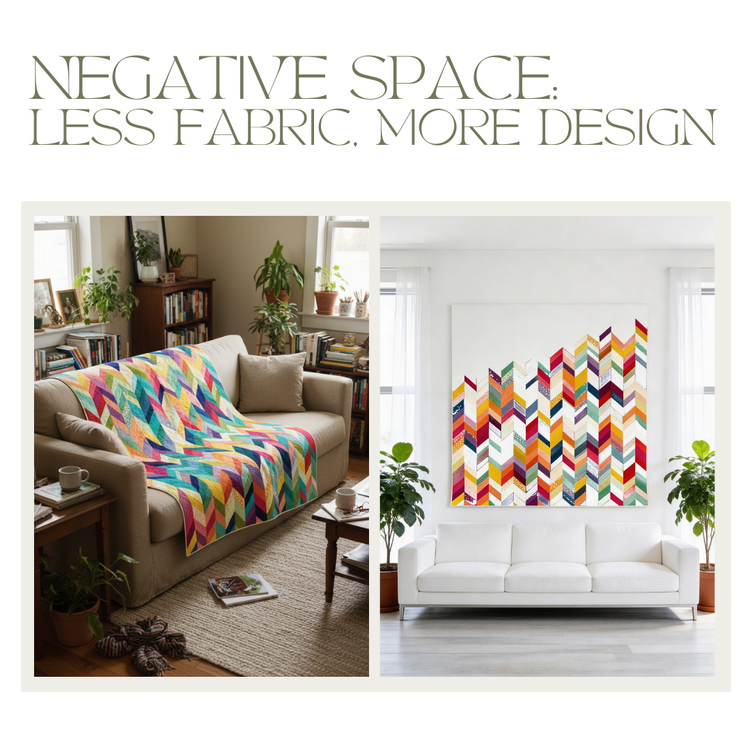
You know that moment when you look at a quilt and think, “Why does this feel so good?” Not just pretty.
Not just clever.
It’s… calm. Confident. Like it’s not trying to win an argument.
You can see the blocks. The fabrics. The skill. But there’s also something quietly holding it all together.
The answer is negative space.
And yes, I’m saying it out loud: it’s the most underrated design tool in modern quilting.
Because sometimes the most powerful part of a quilt is the part that isn’t shouting for attention.
What Is Negative Space — and Why Aren’t We Talking About It More?
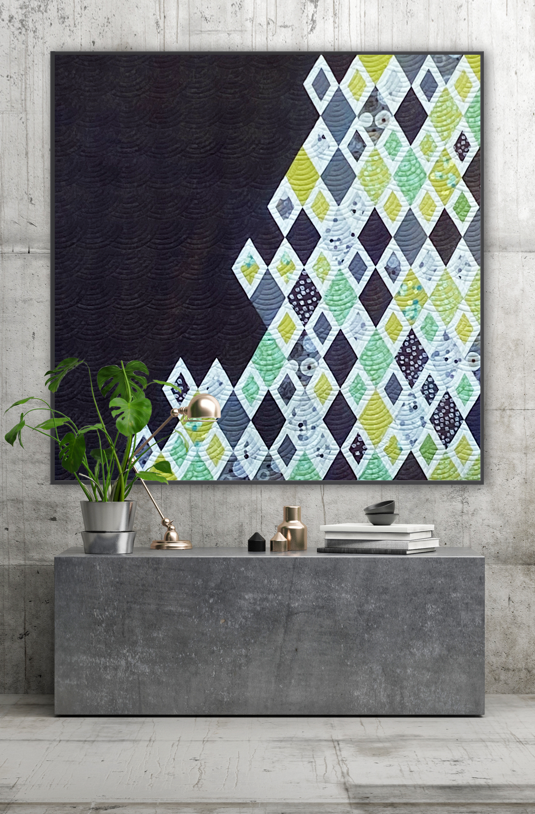
Negative space is actually something positive: It is the “not busy” part of a design.
The area with no pattern.
No piecing line.
No statement print doing the absolute most.
Just fabric. Often a light solid, or a low-volume that knows how to behave.
Sounds boring? Adorable.
Because in graphic design, architecture, and fashion, negative space is not an afterthought. It’s a real design element. It’s not what’s missing. It’s what makes everything else look intentional.
And in quilting? It gives us permission to stop treating every square inch like it has to earn its rent.
Which… honestly… is a relief.
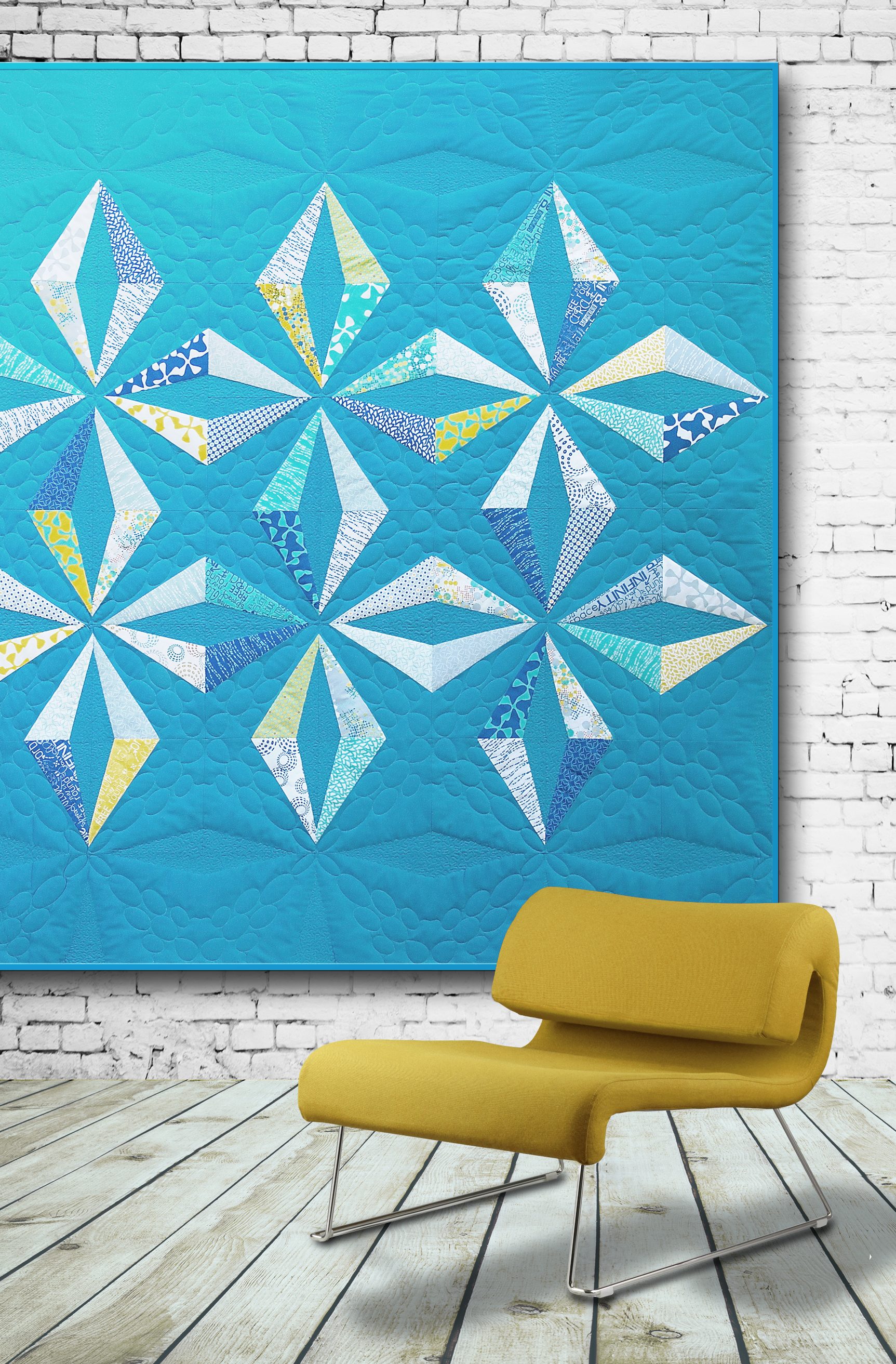
What Negative Space Actually Does in a Quilt
It gives the eye somewhere to rest.
When everything is equally loud, the eye eventually stops listening. Negative space creates pauses. Like in a good conversation. Or after a really dramatic opinion in the group chat.
It makes your hero print the actual star.
A gorgeous print can’t shine when it’s fighting 47 other prints for attention. Give it room, and it glows. Not magic. Just good design.
It creates visual tension (the good kind).
Negative space isn’t passive. It’s active quiet. It pulls the eye. It directs it. It tells you where the story starts, and where it lands.
It makes quilts interior-ready.
If a quilt is meant to live on a wall, or define a space, it needs breathing room. A quiet background turns “handmade” into “designed.”
(And yes, there’s a difference.)

The Biggest Fear Around Negative Space — and Why It's Unfounded
“But it looks so… unfinished.” “So empty.”
Yep. I hear that all the time.
Because we’ve been trained to fill. Fill space, fill corners, fill our quilts with “just one more” triangle until the design is basically shouting.
So when you leave space, it can feel like you forgot something.
You didn’t.
Here’s the Zen Chic truth: Empty is a decision. Not a gap.
Negative space, used on purpose, is not the absence of design. It is design. It’s proportion. It’s placement. It’s the quiet fabric doing the most elegant work in the room.
And yes, it takes confidence.
Because choosing not to add more is sometimes harder than sewing a thousand tiny pieces together.
But when the space is intentional, it’s just as skilled as a complex medallion quilt.
Maybe even bolder.
Because you’re not adding more to prove you can. You’re stopping because you know you don’t need to.


How to Bring Negative Space Into Your Next Project
1. Start with proportion
Here’s a rough guideline: if your quilt has a strong focal point (statement block, hero print, asymmetry, anything with main-character energy), give negative space at least 40% of the surface area.
Sounds like a lot.
It isn’t.
It just feels like a lot when you’re used to filling every corner.
2. Choose your background fabric with intention
Negative space doesn’t have to be white. But it does need to be quiet.
Think: light solid. Soft linen look. Gentle low-volume.
The key is simple: it should frame, not compete.
Your background is the stage.
Let the star do the singing.
3. Place your focal point deliberately — not centered
A block dead center is perfectly fine.
But if you shift it slightly off-center, and give it space on one side?
Now you have tension.
Now you have movement.
Now you have that modern “I meant to do this” look.
4. Study modern quilts like a designer
Next time a quilt pulls you in, ask:
Where is the busy?
Where is the quiet?
How much of this quilt is actually space?
Once you start seeing it, you can’t unsee it. (Sorry. Not sorry.)
One Last Thought
Using negative space doesn’t mean you can do less.
It means you trust your design eye enough to say: this doesn’t need anything more.
And that is not lazy.
That is not “unfinished.”
That is taste.
(It’s also bravery. The quilting kind.)
So if your quilt feels like it wants a little air? Give it some.
Let it breathe.
Let you breathe.
Then go make something beautiful with all that lovely, confident space.